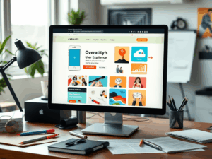
5 Essential Website Navigation Best Practices
We’ve all been there: you land on a website, and the menu is a confusing nightmare. A disappearing submenu, too many options, or endless clicks to find what you need. In 2025, visitors won’t waste time on a frustrating website—they’ll simply leave, maybe forever. That’s why following clear website navigation best practices is critical for your business success.
1. Keep It Simple and Predictable
Your main navigation menu is not the place to get overly creative. Users expect to find it in a familiar location, typically across the top of the page. A clean, simple menu builds trust and makes your site easy to use. Follow these rules:
- Stick to 5-7 Menu Items: Keep your main menu concise. Too many options can overwhelm visitors.
- Use Clear, Obvious Labels: Label your pages with simple terms like “About Us,” “Services,” and “Contact” instead of vague or clever jargon.
- Avoid Clutter: Don’t crowd your menu with icons or other distracting information. The goal is clarity, not flash.
2. Organize Logically with Submenus
If you have more than seven pages, submenus (or dropdowns) are a great way to organize your site without cluttering the main navigation. Group related pages under a single, logical top-level item. For example, all your different services can be listed in a dropdown under a “Services” tab. This keeps the main menu clean while providing easy access to deeper pages.
3. Use a Megamenu for Complex Sites
What is a megamenu? It’s a large, expandable dropdown that can display many options in a multi-column format. These are perfect for e-commerce stores or businesses with many services or product categories. A megamenu can even include images and icons, allowing you to present a large amount of information in a structured, easy-to-scan way.
4. Ensure Your Menu is “Sticky”
A “sticky” or “fixed” menu is one that stays visible at the top of the screen even as the user scrolls down the page. This is a modern standard for user experience because it ensures visitors can navigate to another page at any time without having to scroll all the way back to the top. It’s a simple feature that dramatically improves usability.
5. Prioritize Mobile Navigation
More than half of your website visitors are likely on a smartphone. Your navigation must work flawlessly on a small screen. This typically involves using the standard “hamburger” icon (☰) that opens into a clear, vertical menu. Test your mobile menu to ensure it’s easy to read, tap, and navigate without any frustrating glitches.
Your Menu is a Roadmap to Success
A well-designed navigation menu is the foundation of a great user experience. It guides your customers, helps them find what they need, and is a critical part of your website’s success. At Expert Insights, Inc., we specialize in creating intuitive websites that please both you and your customers.
Need help designing a better navigation experience? Contact us today to discuss your project!