What is a Responsive Website? And Why Your Business Needs One
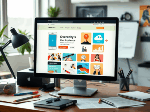
You’ve probably heard the term, but you may be asking, what is a responsive website? Simply put, a responsive website is a single site designed to automatically adjust its layout and content to fit any screen size, whether it’s a wide desktop monitor, a laptop, a tablet, or a smartphone. In 2025, it’s not just a feature—it’s the standard for a successful online presence.
[Image showing the same website displayed seamlessly on a desktop, tablet, and smartphone screen]
1. A Better User Experience on All Devices
An old, non-responsive website is incredibly difficult to use on a phone. Users are forced to pinch, zoom, and scroll endlessly, which leads to frustration and a high bounce rate. A responsive website provides a seamless experience by automatically adjusting its layout for easy reading and navigation. This leads to longer visit durations, increased engagement, and higher conversion rates.
2. Higher Rankings with Mobile-First SEO
Google now operates on a “mobile-first indexing” system. This means it primarily uses the mobile version of your website for indexing and ranking. If your site isn’t mobile-friendly, your search engine rankings will suffer significantly. A responsive design is the most effective way to provide a great mobile experience, which can directly lead to higher visibility and more organic traffic from search engines.
3. Simplified Management (Saving Time and Money)
In the past, businesses had to build and maintain a separate mobile version of their website (e.g., m.yourbusiness.com). This was costly and inefficient. A responsive website eliminates this need entirely. With only one site to update and manage, you save significant time and resources on maintenance, allowing you to focus on running your business.
4. Increased Reach and More Conversions
With more and more people using their smartphones to browse and buy, your business must be accessible on mobile. A responsive website ensures that your products, services, and message are easily accessible to all potential customers, regardless of the device they are using. This wider reach naturally leads to more leads, sales, and growth for your business.
Is Your Website Truly Responsive?
In today’s mobile-driven world, a non-responsive website is actively turning customers away. Ensuring your site is built with responsive capabilities is one of the most fundamental investments you can make in your digital success. You can check your site’s performance with Google’s Mobile-Friendly Test.
Want to ensure your Springfield business website is ready for any device? Contact Expert Insights Inc. today for a free evaluation!